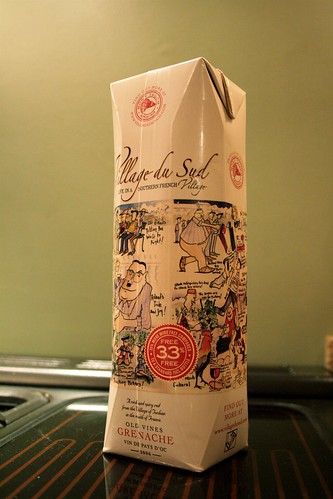
Le Village du Sud is a new brand concept from the well respected Mont Tauch cooperative in the South of France (specifically in Fitou).
It caught my attention as, once again, they are being pretty innovative with their branding and their route to market. They have usually provided wines that are a cut above the competition, and they have also been much more willing to take on marketing activities, such as bringing wine makers and grape growers (who speak no English but really look the part) to wine tastings across the UK, including the BBC Good Food Show where I saw them.
This time it is the Tetra Pak, something I have written about in the past. Once again it is available from The Coop. They are certainly keener than most to do something 'sustainable' and positive for the environment - whether environmentally friendly or fairtrade.
 The wine in question is an Old Vine Grenache in a 1 litre tetra pak. The packaging itself is a little different, with extra angles and a "prism shape". However, what I found intriguing is that they have managed to move the design away from being a pseudo glass bottle. They have realised that a tetra pak allow you to do a lot more with the packaging than simply copy the information from a label (which is always extremely limited) or to show a picture of a bottle or glass (the usual cop-out).
This one has a series of cartoons that give the wine an extra dimension of personality not usually associated with Vin de Pays d'Oc, especially as it is in English. This is very bold, forward-thinking and fun.
Shame about the wine!
As I always point out, this is not a site for tasting notes, but I did try this wine to see if I could detect something specifically "tetra pak like" in it, just to see if the packaging affected the taste. Now, I admit this was not done blind, but I have no problem liking wines in other packaging, so I was not negatively predisposed. However, I found a very unpleasant aftertaste in the wine which I assume must come from the packaging as I do actually like their wines normally. I'd love to read more informed views on whether this is a truly inert packaging format for wine.
Finally, a niggle. If you look at the front of the packaging, you'll see a badge which I also saw on the previous tetra pak I reviewed called masterpeace.
"33% free" and "33% more wine free compared to a standard 75cl bottle"
FREE? There are lots of objections to this statement, chief of which is that this wine is NOT available in 75cl glass bottles, so how can it possibly be compared? Also, this wine was already discounted, ostensibly for the launch, from £4.99 to £3.99. Quite how much of a cheap and "drink loads" mentality do they want to associate with this wine?
I do hope that 1L formats will not keep using this statement.
Overall review; nice idea, but once again more show than substance, largely due to the final quality of the wine.


2 comments:
Seems rather cheap - even in a tetra pack - for a quality wine. Perhaps it was more the wine rather than the package that just tasted bad? Mind you would quality wine in a tetrabox sell?
I do like the cartoon aspect but again is that going to sell expensive wine in a box?
I agree, but I wasn't expecting first growth, just a decent wine. The start was fine but the finish was 'plastic' (best way to describe it) and there is still something chemical to the empty packet (I emptied the wine eventually and rinsed it).
Buyers may or may not like the cartoon aspect for higher price wines. I wasn't suggesting all tetra paks should do the same, but what I liked was that they are using the whoe real estate to communicate with the buyer. Thinking literally "outside the box" - damn, that would have been a better title!
Post a Comment